Neobrutalism on the web: what it is, where it comes from and when to use it
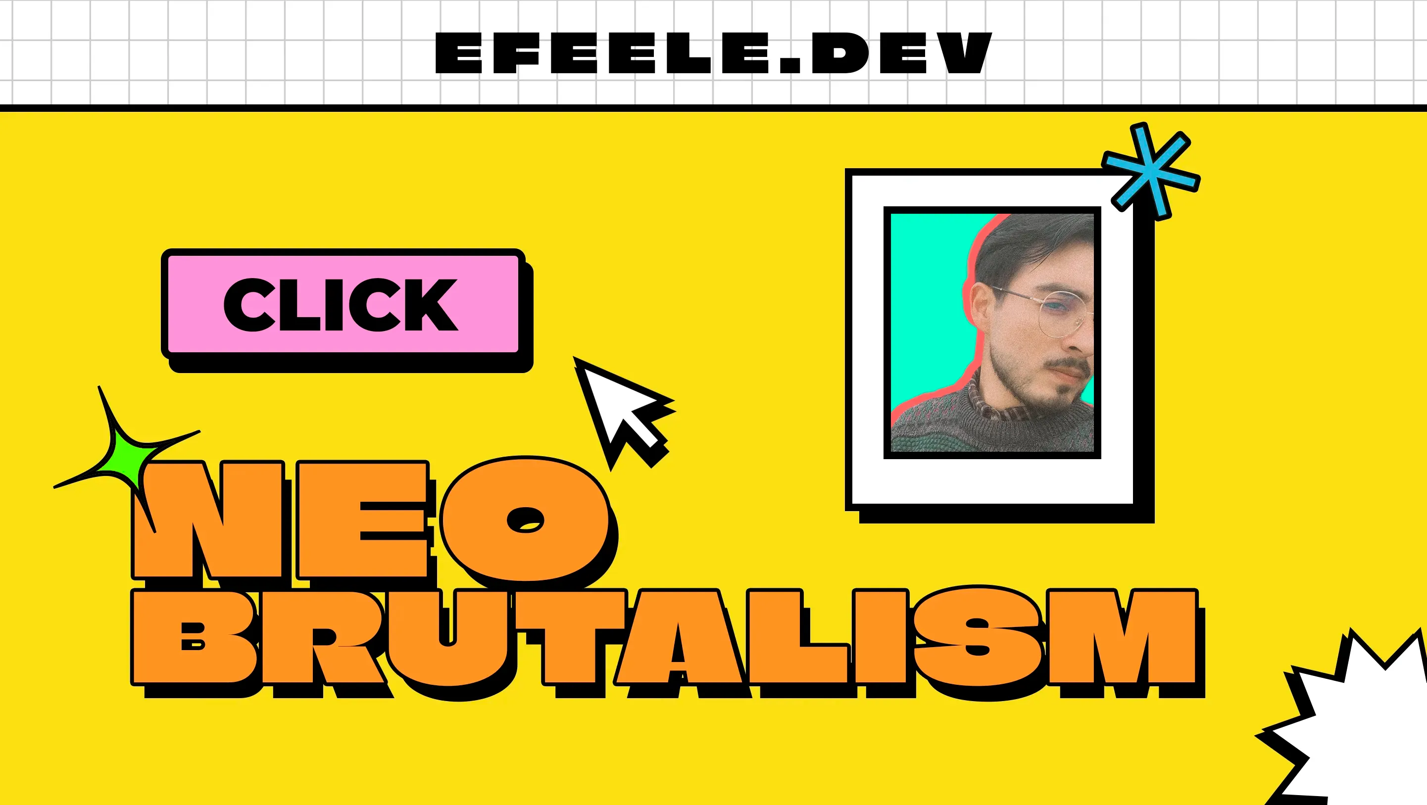
While Apple is making the gloss and transparency of glassmorphism fashionable again, another style is heading the opposite way: neobrutalism. Saturated colors, thick borders, solid shadows and nothing trying to hide the structure of the page. It’s a throwback to early digital design, in software and on the web.
I like it so much that I designed this article’s banner in the same style.
Where it comes from
Its roots are in brutalist architecture, which left materials exposed, unclad, in angular geometric shapes. Brutalism later moved into graphic design with the same idea: direct and unornamented.
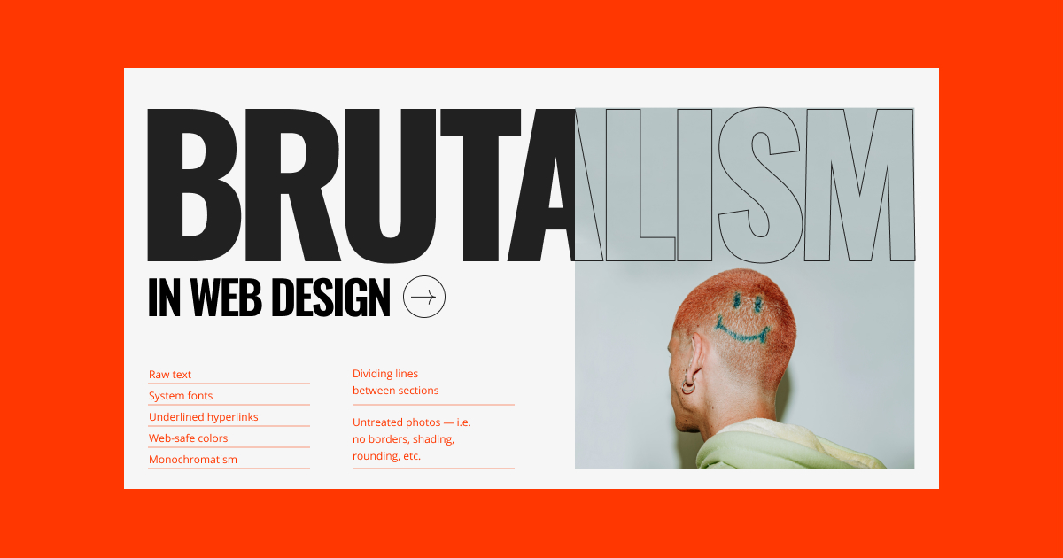


From brutalism to neobrutalism
The “neo” marks an evolution: neobrutalism keeps brutalism’s traits but adapts them to today’s web, with brighter colors, interactivity and a nostalgic feel that recalls 90s design.
The Nielsen Norman Group describes it as a reaction against sleek, minimal design, a deliberately loud and almost rebellious visual language. Their caveat is the important part: the look grabs attention, so designers have to weigh that distinctiveness against usability rather than assume the two come for free. Read the full article.

How to recognize it
- Color: strong contrast and very saturated colors, deep blacks, heavy shadows and backgrounds that move away from the usual white.
- Typography: large, heavy type with a very obvious hierarchy.
- Shapes: blocks, hard lines and structure you can see.
- Composition: asymmetric layouts, visible grids and overlapping elements.
- Finish: visible borders and outlines, with an almost handmade look.

When to use it and when not to
It works well for projects that want to step away from the conventional: portfolios for creatives, agencies, startups, or brands that want to come across as direct and straightforward.
People often say it clashes with accessibility, and I think it’s the other way round: done well, it meets a lot of the guidelines. High contrast, borders that clearly mark where each element starts and ends, large buttons and heavy type are exactly what the guidelines ask for. Where you do need care is on pages with a lot of text to read slowly: that much saturated color around it gets tiring over a long read.
If you use it, three things help keep it from turning into chaos:
- Keep enough contrast and legible type, even when the style tempts you to exaggerate.
- Use a short, coherent palette that helps organize the content, rather than a different color for everything.
- Test it with users, because that much visual intensity can easily confuse people.
Examples for inspiration
Further reading
- Neobrutalism: Definition and Best Practices – NNGroup
- How can I design in the Neo Brutalism style? – Medium
- What is brutalism in web design – Elementor
What I did with all this
I applied everything I researched for this article to Moda en Movimiento, a small website for a custom merchandise brand, built with Astro and Tailwind in a neobrutalist style. It’s one of the sites I’ve most enjoyed building (it’s also in my portfolio).
Update, September 2026: I’m building a web accessibility tool (I mention it in this article), and one of its versions will have a neobrutalist design, precisely because the style meets a lot of accessibility guidelines.