The accessibility features I built into government platforms
Update, September 2026
A menu like the one described here helps, but it doesn’t make a site accessible on its own: what an audit checks is the WCAG criteria. I cover that in WCAG 2.2 level AA: what to check in an audit, which is worth reading alongside this one.
I’m also building my own web accessibility tool, which you’ll be able to use from npm, with plain JavaScript or as a WordPress plugin. It isn’t finished yet; I’ll write about it here when it is.
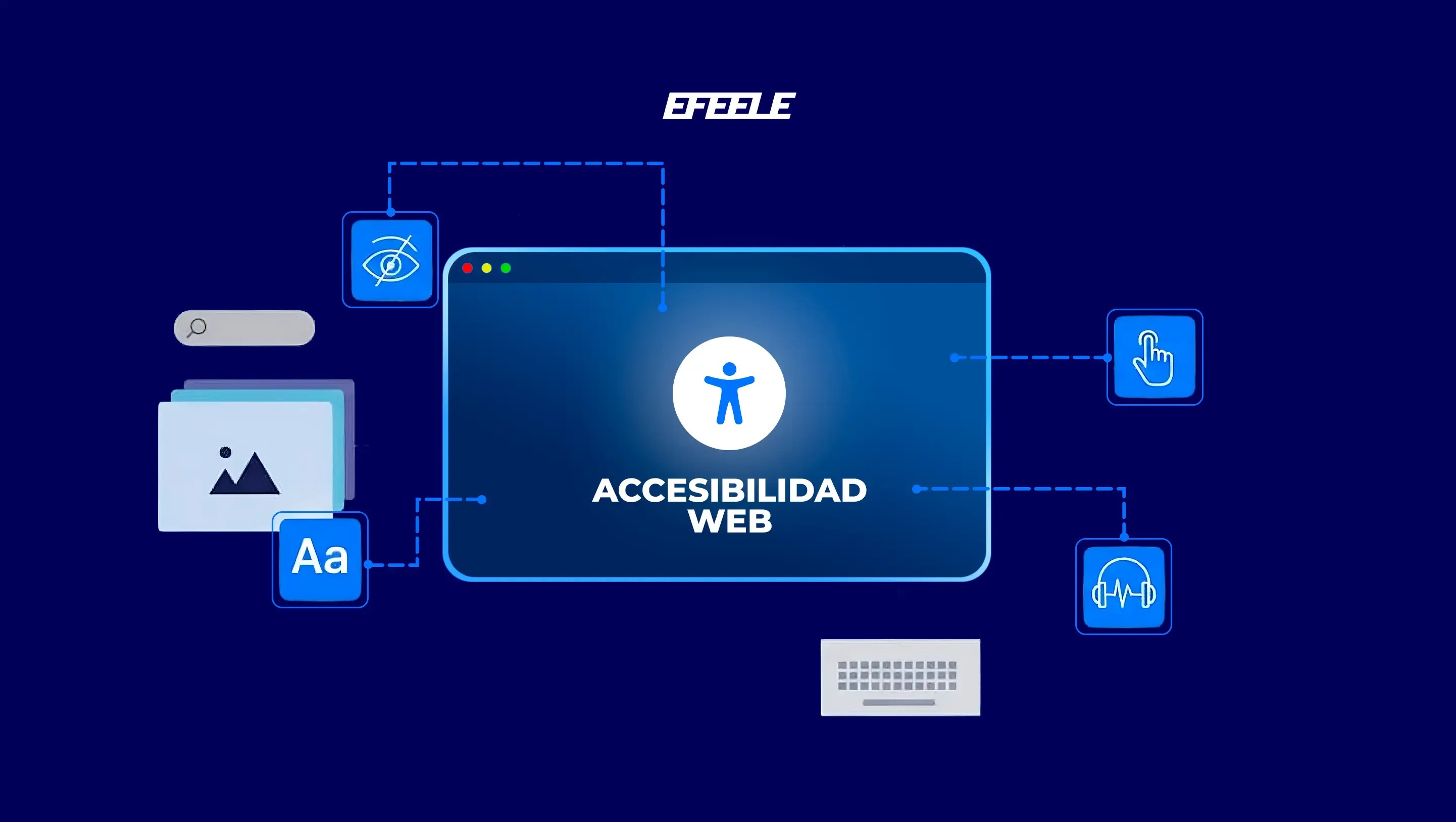
Web accessibility is often reduced to “make the text bigger” or “use stronger colors”, but it goes a lot further than that. An accessible platform has to adapt to very different visual, cognitive and motor needs.
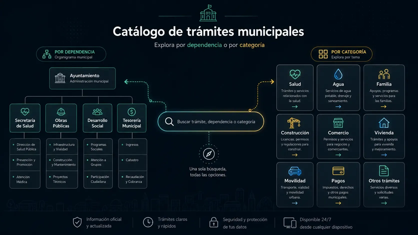
I’ve implemented these features on several sites and platforms for the municipality of Tizayuca, including its services catalog. These are the options the accessibility menu includes and who each one helps.
Color and visibility
Mainly for people with low vision, sensitivity to certain colors or trouble telling shades apart.
- Invert colors: inverts the site’s colors, which some people find more comfortable.
- Grayscale: removes color from the page and cuts down on distractions.
- Low and high saturation: turn color intensity down or up.
- Low, high and extra contrast: adjust contrast so content stands out better.
- Highlight links: marks every link so they’re easier to find.
Typography
Useful for people with low vision, dyslexia, older adults, or anyone who needs more comfortable reading.
- Font size: enlarges the text across the whole page.
- Line height: adds space between lines so text doesn’t look crammed.
- Letter spacing: spreads letters apart so they’re easier to read.
- Text alignment: lets each person pick the alignment that works best for them.
Images and video
- Hide images: leaves only the text, for distraction-free reading.
- Hide videos: turns videos off to avoid distractions or accidental playback.
Focus and reading
For people with low vision or attention difficulties.
- Big cursor: swaps the pointer for a large circle that’s easier to follow.
- Reading mask: darkens the page except for the strip being read.
- Reading guide: a horizontal line that follows along through long texts.
Menu settings
- Change position: moves the menu to the left, right, top or bottom.
- Save settings: stores the choices in the browser and applies them again next time.
- Reset: puts everything back the way it was.
Why so many options
Because everyone uses the web differently:
- An older adult may need larger text.
- Someone sensitive to certain colors may prefer grayscale.
- A person with ADHD or dyslexia may appreciate a reading guide.
- Someone with low vision may need a bigger cursor or more contrast.
On a public platform this matters even more. Online services have to work for everyone, without exception.
The plugins I use
To implement all of this I use an open-source plugin by Praboth Charith:
github.com/PrabothCharith/accessibility-plugin
It’s free and adds a complete accessibility menu to any site without building each feature from scratch, which helps a lot on projects with limited resources, as local governments and small organizations usually are.
On WordPress sites I’ve used this one, with very good results:
Pojo Accessibility on WordPress.org
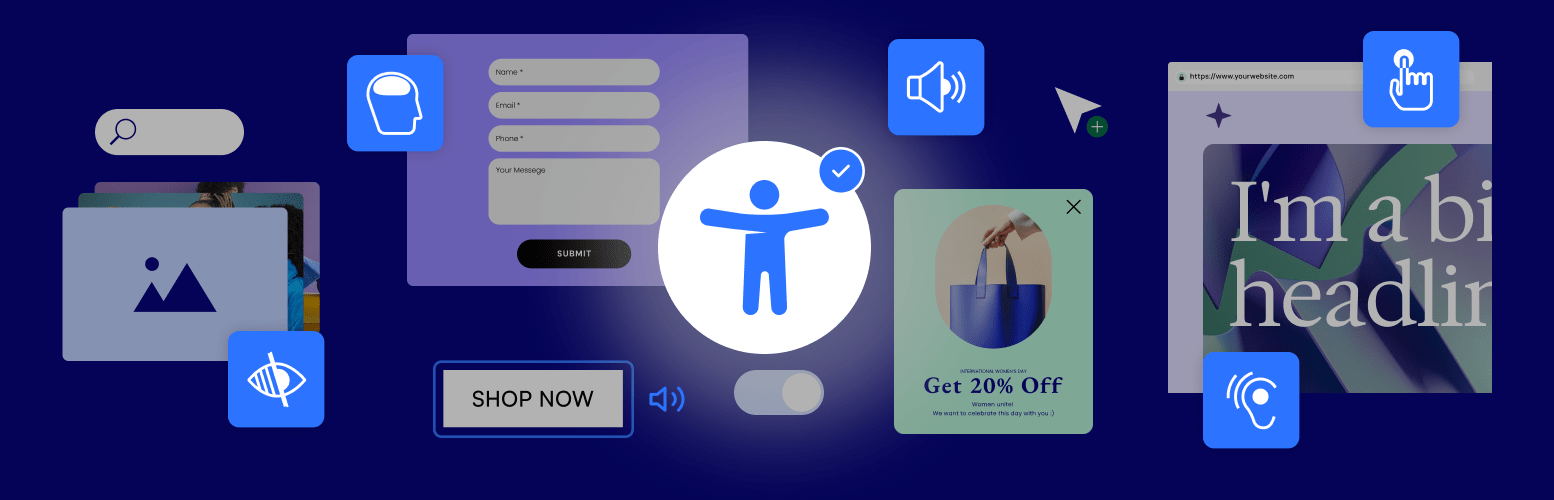
It adds an accessibility panel that’s easy to configure and works with most themes. It’s a good option when you want something that works without writing code.
If you work on a government platform
If you work at a public institution or you’re building a government platform and want to add these tools but don’t know where to start, I can help. To get accessibility to as many people as possible, I offer free support to integrate them into government websites.
Email me at hello@efeele.dev and tell me about your project: what kind of platform it is (a portal, a public consultation, online services…) and what you’d like to achieve.